
10 Things You Can Do to Improve Your Instagram Feed Today (And for free!)
We are all CONSTANTLY hearing about how important Instagram is, am I right?! It is SUCH a powerful platform, but sometimes, when you begin to use it for business, it gets slightly overwhelming-- we see so many people with beautiful, perfectly curated feeds and wonder “HOW does everything they do match?! How does their feed look so good?!”
Here are 10 tips I have learned over the years as both a past social media manager and a current brand designer to keep your Instagram feed looking good and professional:

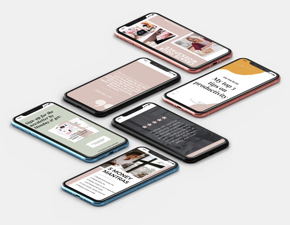
PHOTO VIA PLANN
1.Plan out your grid ahead of time
This is so, so important and step one to really being able to get your Instagram look beautiful and curated! Download an app that allows you to drag and drop images around so you can make sure it fits in your feed before you post it. I use PLANN, but I know a lot of other entrepreneurs who also use and love Planoly.
This also answers the question so many people ask- “How do you get spaces in your captions?!” These apps allow you to copy and paste the captions directly from the app and the spaces stay the exact same- it saves so much time instead of having to try to make the line breaks between paragraphs manually.
I recommend planning out your grid one-to-two weeks in advance, so you can really get things looking great without planning TOO far ahead so you can post things that are timely, too. Planning your grid and batching content this way will save you so much time in the long run, too.
2. Pick a filter and use it for all of your photos
This is one of the easiest ways to make your feed look consistent and branded! Choose a filter, or a preset, and use it on every single one of your photos. It doesn’t matter if it’s an Instagram filter, black and white, a Lightroom Preset, or a filter from an app. Using the same one consistently (even though some images will look better with others, sticking to one makes your entire feed look better) makes a HUGE change in how things look visually on your profile.
My favorite go-to filter is A5 on VSCO cam. I adjust it a little every time I use it (the exposure and white balance) and have been using it for years now. I love how the blue tones are brought out in it. I totally recommend VSCO cam or A Color Story to get started with filters.
3. Pick 5 categories of things you want to post about
Feel like you are constantly stuck when it comes to figuring out what to post, and what to say? I used to feel that way all the time-- scrolling through old photos on my camera roll, trying to figure out exactly what I could use to throw on my Instagram feed today just to post something. This was hurting my engagement tremendously because I was posting just to post- but not posting intentionally…
That’s when I heard Jenna Kutcher talk about her “Jenna Five” which is basically five things she sticks to posting and talking about that are part of her brand.
It made producing my content so easy when I figured out which five categories I wanted to keep rotating through! I never ran out of content, was able to re-purpose so many blogs, and could easily find an image that was relevant to post.
Here’s an example of my five categories so you can craft your own…
Self-care + inspiration
My dog/ home
Myself/ behind-the-scenes
My work (logos/websites)
Interior Design
Doing this and having this to reference made figuring out what to post SO easy. I knew that regardless, I could share something that’s important to be that reflects my brand and these categories without sacrificing quality content.

4. Figure out your color palette
The PLANN app allow you to see the colors you are currently using on your Instagram feed which is incredibly helpful-- but that can totally change! A lot of people post whatever they have without figuring out their brand colors first and not having a set color palette is the easiest way to lose consistency with your visual identity online.
If you can’t afford a brand designer to help you with your brand identity yet, I recommend getting on Canva and creating a photo collage (aka a Moodboard) of photos and things you are naturally drawn to to see what colors come naturally to you. For example, I use a lot of black, blues, greens, and a hint of mauve occasionally. I chose these colors based both off of color psychology I’ve learned along with what I realized I wore most frequently and how my home was decorated. It becomes so easy to execute my brand since the colors I chose are colors that do come so naturally to me.
Also, remember to choose colors that work with your brand and that will resonate with your ideal clients - not just colors that look pretty, you guys! It is so, so important to make sure every part of your brand is evoking the feelings you want it to for your ideal clients. Check out the color palette board to the left that comes with my Canva templates in the shop page - you can tell they are reflecting the mood/words that I get from a lot of coaches I work with. Everything. Has. To. Be. Based. On. Strategy. Everything.
5. Use branded templates
Another thing I totally recommend Canva for if you are DIYing it! Take those beautiful colors you chose and create three to five templates with them. I typically recommend creating a template for a quote, a template for information/ facts, and a template that is more image-heavy. Use the same fonts and colors in the templates and then that way all you have to do is come back and plug in information before posting. It will save you SO much time and really help you feed look consistent- because instead of having a million different templates with a million different colors, they will all totally coordinate.
Want some help with this? Check out the pre-made Canva templates in my shop. These are what clients use to get crazy killer results with engagement on social media. You can brand them and make them your own to show up like the expert you are.
6. Use high-quality images
This doesn’t necessarily mean you have to invest in branding headshots (even though it is one of the first things I recommend investing in in your business,and I talk more about that here). But, make sure the images you are using are as quality as they can be- even if they come from your phone! Make sure light is always in front of you- not behind you. Stand by a window and prop your phone up with a self-timer. Use quality stock photos from sites like Pixabay and Unsplash.
Having quality images on your feed automatically makes it look more presentable and makes you seem more credible! People have the attention span of a goldfish, so it is so important to really “wow” them within the first few seconds they come across your feed. A lot of my images on my feed were taken with an iphone, it’s just not noticeable because I filter them all the same so they still look quality.

7. Use a photo of yourself on your profile
This is coming from a logo designer who knows how much you may want to show your beautiful logo off in your image on your profile! BUT, people want to connect with you first, and your brand second. Show a quality image with your face in it as your profile image on your Instagram so people already have a sense of you and who you are. If you opt not to do this or feel like none of the images you have work, that is totally okay, just make sure that you are seriously splattering your face all over your feed. (Seriously!)
When I first started out in the online marketing world and even working on my own website, I hated seeing my face as much as I did everywhere. I felt so exposed! BUT then I realized that’s what was working for me to make the genuine connections I did. People really got a peek into my life-- my clients know what it looks like when I’m sitting at my desk working, they know what my dog looks like, they know what my apartment looks like-- it really helps them connect with me and trust me.
If you look into any marketing guru online, they’re probably splattered all over their feed and website. You get used to it after a while, and you’ll see the difference in makes in being able to get people to engage with you and connect. (This goes with instagram stories also- SHOW YOUR FACE LADIES!)
8. Make your Instagram highlight section coordinate
I love Instagram story highlight covers (and I design custom ones, too) but I also think there’s a way to coordinate without them as well. I prefer to use images as my highlight covers and I just try to make sure that they all have the same sort of feel and color palette. I’ve seen it done both ways- but just making those covers coordinate and making the names of the highlights different than just the standard “highlights” will add a lot to your profile!
9. Shorten lengthy links in your bio
You know when you go to someones profile and they have a link so long that it makes everything look so cluttered? No one wants that! If you are linking something long, I recommend using goo.gl to shorten the link for your profile. If you want to use multiple links all the time, I recommend a page on your website that allows for links (for example, mine is karimacreative.com/links). That helps really clean things up on your profile and it gives the people visiting your profile a clear call to action!
10. Stick with the same theme.
This is a general rule that really wraps up all the other rules- but it is so important. Stick with a theme both aesthetically and strategically. Your Instagram is a portfolio for you to share the highlights of your life- both business and personal. It’s what you’ll reference when you reflect on the year and look back on memories. It is your legacy. So post with intention, share your story, be authentic, be vulnerable, and utilize the app to it’s full potential.
As far as a visual theme- there will be photos you want to share that don’t match your aesthetics at all. (Ie: I took some really cool photos in Vegas that were against a pink wall, but pink is totally not on-brand for me). Instead of adding them to your feed- add them to your story! That way you can share them but it won’t disrupt the flow you have going on. Crop your images the same way. Try to shoot the images you take yourself from similar angles. It’s all in the details and the little things will be HUGE when it comes to consistency!
So there you have it, my top 10 tips to improve your Instagram feed without having to budget any money and hardly any time. Once you apply these ideas you will start to see a HUGE difference and really start to feel like you are in control of your visual identity and you’ll be able to kiss goodbye the feeling of never knowing what exactly to post.