The Five Things Your Logo Should Be


Something I get asked a lot from clients, friends, and even strangers is “What makes up a good logo?”
I work with so many creative entrepreneurs who find the absolute most beautiful hand-illustrated super-freaking-intricate logos and send me examples of them when they want something designed for their own brand.
I learned a lesson back when I was working in the corporate world and went through the branding process with my old company (I wasn’t doing the work, I was just the director of marketing that helped make some of the big decisions). This was a HUGE branding project, we’re talking an almost six month timeline with a six figure price tag.
I remember walking into the conference room with the entire team, we were all so excited to see what the agency had built out for the first concept of the logo design. The presentation screen flipped on and the first slide deck with the logo sat before our eyes.
Underwhelmed, my bosses looked at eachother and mumbled “Really? That’s it? I feel like we could have done that ourselves.”
It was a pretty simple wordmark. One font. Two colors. That’s it. But it was SO powerful.
We went to lunch afterwards and I explained to them how logos don’t have to be complicated, rather just impactful. I talked with the designers at the agency about their thought process behind it. Even such a simple logo had an entire conference room full of post-it notes, dozens of revisions and so much meaning behind it with the strategy.
“I strive for two things in design: simplicity and clarity. Great design is born of those two things.”
After explaining it to them, showing them examples of the biggest brands in the world and the simplicity of their logos, they really began to understand the importance. I remember going back into that conference room in the agency where they referenced a podcast that explained the five things a logo should be. It is something I reference with each and every logo design and something that truly changed me as a designer.
I used to try to do TOO much to be too unique and different. Then I realized-- your logo is a small part of your brand. It isn’t your entire brand. It is a vessel you pour your brand into.
SO, YOUR LOGO SHOULD BE THESE FIVE THINGS:


1. Simple
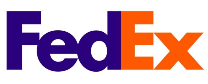
Think of the biggest brands you know that are the most powerful. McDonald’s. Coke. Nike. Apple. Squarespace. Facebook. Adobe. Uber. Amazon.
All of them have incredibly simple (but meaningful) logos. None of them are crazy or super intricate- they are designed so simply based on the strategy behind their brand. And that is why they are effective.
People get so caught up in wanting a logo that is truly unique (and yours should be!) That they want to go so far away from simplicity when that is the exact direction you should be moving towards. It should be yours, but it should be simple. This is something that is tried and true in the design world and the reason that even the biggest companies in the world keep their symbol/logo very minimalist.
“Make it simple, but significant.” –Don Draper

2. Memorable
While I will preach on simplicity all day- it does have to be unique to your brand and MEMORABLE. You want someone to see your logo- whether your primary logo or a submark, and instantly recognize your brand. You want it to be unique in the aspect that it doesn’t look cookie cutter or just like anyone else’s. You want it to be truly yours and something that has enough impact so when someone sees it they will automatically associate it with you.
“Ultimately, the only mandate in the design of logos, it seems, is that they be distinctive, memorable, and clear.”
- Paul Rand
3. Adaptable
This is where I see a lot of people mess up. Your logo should be able to scale and adapt to fit ABSOLUTELY everything, people!
Here are some questions you should ask yourself while designing your logo…
Will it look good in black and white, as well as color?
Will it look good on a billboard, as well as a tiny icon for an app on a smart phone?
Will it look good embroidered on a shirt?
Will it look good in reverse colors?
These questions are crucial! Even if you aren’t thinking this way now- there will be a time and a place where you will ask yourself some of these questions. I worked in marketing for a company who didn’t consider this when designing their primary logo. It was intricate. They then realized when ordering promo materials, they had too many colors to get printed. The design was wayyyyy too intricate to transfer on a print material like a shirt well. The design got lost in print advertisements. They were told time and time again to simplify their logo because it simply could not adapt.
“A designer knows he has achieved perfection not when there is nothing left to add, but when there is nothing left to take away.” Antoine de Saint-Exupéry
4. Timeless
So many of the watercolor/ complicated and intricate logo trends right now are just that- trends. Trends come and go and it’s why so many people are finding themselves looking to rebrand in 3, 5, 10, 20 years. When you have a strong brand, you should only have to update your brand with time (ie: Starbucks, Coke, Little Debbie), while still keeping the complete same visual identity.
Something as important as your logo and brand should truly be timeless. This means not following the latest logo design trends and wanting to mimic it exactly, rather finding something that truly will serve you and your brand for so many years to come.
“Leave trends to the fashion industry – Trends come and go, and when you’re talking about changing a pair of jeans, or buying a new dress, that’s fine, but where your brand identity is concerned, longevity is key. Don’t follow the pack. Stand out.”
- David Airey
5. Relevant
Simply put, your logo should make sense.
While you want it to be your own, you also want to make sure that it fits within bounds of what your ideal customer will be attracted to, and consider everything from subconscious meanings behind the shapes you use to color psychology. Your logo should make people feel and it’s the designers job to do that with composition, typography, colors, and shapes.
I am always an advocate for not doing what everyone else in your industry is doing and creating your own path (especially for creatives) but it is important to ensure that your logo will be marketable and make sense to those who you are trying to attract- and sometimes the best way to do that is to study other brands in your industry- what are they doing, and why is it working so well?
Keep in mind- you don’t have to ever have a logo that is completely literal to your brand. If you sell shoes, your logo doesn’t have to be a shoe, etc., etc.
“Surprising to many, the subject matter of a logo is of relatively little importance, and even appropriateness of content does not always play a significant role.
This does not imply that appropriateness is undesirable. It merely indicates that a one-to-one relationship between a symbol and what it symbolized is very often impossible to achieve and, under certain conditions, objectionable.-Paul Rand